Fitxer:Annual Average Temperature Map.jpg

|
Aquesta imatge (de tipus meteorology) s'hauria de tornar a crear utilitzant gràfics vectorials com ara un fitxer SVG. Això té diversos avantatges; en trobareu més informació a Commons:Media for cleanup. Si ja disposeu d'una versió d'aquesta imatge en format SVG, us preguem que la pengeu; després, reemplaceu aquesta plantilla amb la plantilla {{Vector version available|nom nou de la imatge.svg}} en aquesta imatge.
|


Resum
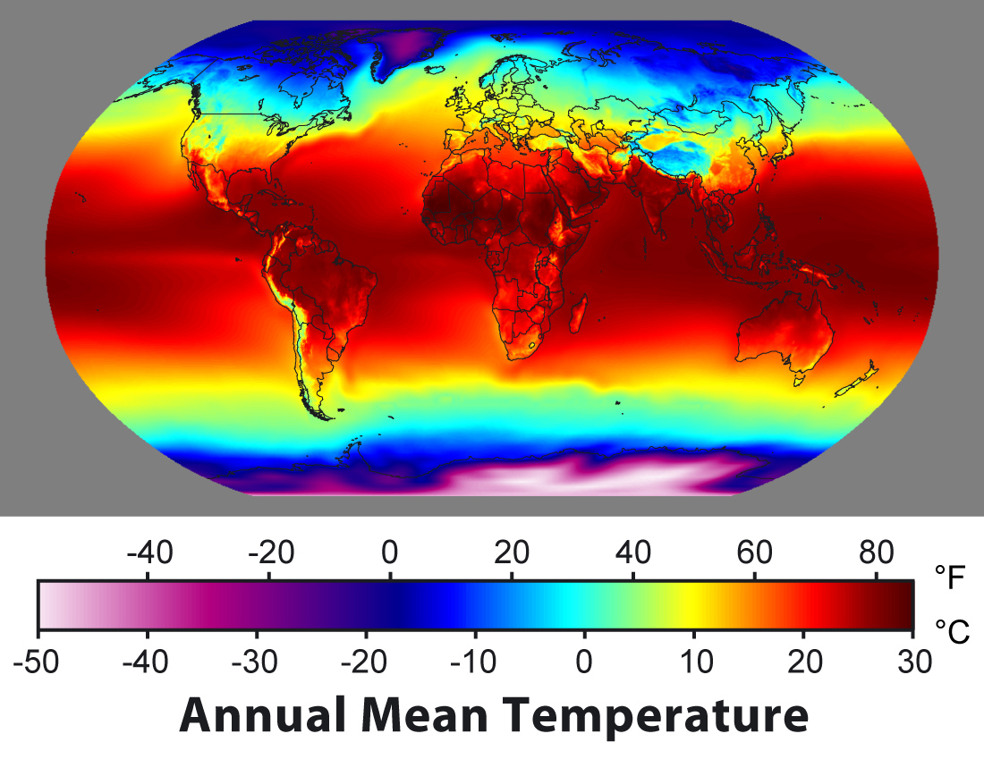
This is a global map of the annually averaged near-surface air temperature from 1961 to 1990. Such maps, also known as "climatologies", provide information on climate variation as a function of location.
The tropics, between the Tropic of Cancer and Tropic of Capricorn, have the most direct sunlight and highest temperatures. While the seasonal contrasts in surface temperature are due to the tilt of the Earth axis, there is relatively little variation in the annual average sunlight received throughout this entire tropics, and hence the entire band has similar temperatures. Above the tropics, temperatures fall off more rapidly as one travels towards the Earth's poles, at a rate of approximately 1 °C for every 145 km (1 °F per 50 miles). Permafrost will form at positions where the annual average temperature is below 0 °C.
The other key factor in determining surface temperature is elevation. Surface temperature declines ~1 °C for every 220 m (1 °F per 400 ft) in elevation above sea level. The coldest portions of Earth are the Greenland and Antarctic Ice Sheets, which combine both very high latitude and high elevation.
Data sources
This map was produced by combining the 10' CRU CL 2.0 archive copy at the Wayback Machine land-surface temperature data set (New et al. 2002) with the 1° NOAA OISST version 2 archive copy at the Wayback Machine sea-surface temperature data set (Reynolds et al. 2002) and the 2.5° NCEP/NCAR Reanalysis version 1 archive copy at the Wayback Machine data set (Kalnay et al. 1996). OISST was used for low- and mid-latitude ocean temperatures, but NCEP/NCAR was substituted in sea ice-forming regions, where OISST would overestimate the near-surface air temperature. In addition, a small offset was added in all regions to the OISST sea-surface temperatures to match the NCEP/NCAR air temperatures, and thus account for the difference between ocean and air. NCEP/NCAR was used for Antarctica, since it was the only data set including this region.
Copyright
This image was created by Robert A. Rohde for Global Warming Art.

|
S'autoritza la còpia, la distribució i la modificació d'aquest document sota els termes de la llicència de documentació lliure GNU versió 1.2 o qualsevol altra versió posterior que publiqui la Free Software Foundation; sense seccions invariants, ni textos de portada, ni textos de contraportada. S'inclou una còpia d'aquesta llicència en la secció titulada GNU Free Documentation License. |
| Aquest fitxer està subjecte a la llicència Creative Commons Reconeixement-CompartirIgual 3.0 No adaptada. | ||
| ||
| Aquest avís de llicència s'ha afegit a aquest fitxer d'acord amb l'actualització de la llicència GFDL. |
Une deuxième raison pour laquelle la température de surface dépend de la latitude est la variation de l’épaisseur d'atmosphère traversée par les rayons lumineux. Lorsque les rayons sont perpendiculaires à la surface, l'épaisseur d'atmosphère traversée est la plus faible ; la lumière est moins absorbée et moins diffusée par l’atmosphère et la surface reçoit d'avantage d'énergie solaire.
A l’équateur la surface du globe est, côté soleil, perpendiculaire au rayonnement solaire tandis que près des pôles la surface est presque parallèle. L’énergie solaire reçue par unité de surface est donc plus importante près de l’équateur que près des pôles.
References
- New, Mark, David Lister, Mike Hulme, Ian Makin (2000). "A high-resolution data set of surface climate over global land areas". Climate Research 21: 1-25. Archived from the original on 2009-02-12. Retrieved on 2008-02-15.
- Reynolds, R.W., N.A. Rayner, T.M. Smith, D.C. Stokes, and W. Wang (2002). "An improved in situ and satellite SST analysis for climate". J. Climate 15: 1609-1625.
- E. Kalnay, M. Kanamitsu, R. Kistler, W. Collins, D. Deaven, L. Gandin, M. Iredell, S. Saha, G. White, J. Woollen, Y. Zhu, M. Chelliah, W. Ebisuzaki, W.Higgins, J. Janowiak, K. C. Mo, C. Ropelewski, J. Wang, A. Leetmaa, R. Reynolds, Roy Jenne, Dennis Joseph (1996). "The NCEP/NCAR 40-Year Reanalysis Project". Bulletin of the American Meteorological Society 77 (3): 437–471. Archived from the original on 2008-07-24. Retrieved on 2008-02-15.
derivative works
Derivative works of this file: Annual Average Temperature Map East Asia.png
Historial del fitxer
Cliqueu una data/hora per veure el fitxer tal com era aleshores.
| Data/hora | Miniatura | Dimensions | Usuari/a | Comentari | |
|---|---|---|---|---|---|
| actual | 10:36, 15 feb 2008 | | 1.100 × 849 (385 Ko) | wikimediacommons>Dragons flight | {{Information |Description= |Source= |Date= |Author= |Permission= |other_versions= }} |
Ús del fitxer
Les 2 pàgines següents utilitzen aquest fitxer: